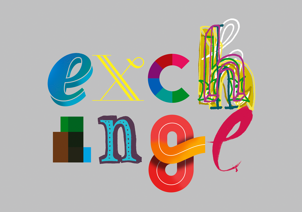
The work for the upcoming Exchange exhibition is rapidly coming together (but it will as always be a last minute rush to complete it). I had to take a break from it as I was asked to produce a logotype to promote the exhibition — luckily I have literally thousands of custom letters floating around on my hard-drive from my studio work. The current final outcome looks very much like the ‘h’ in this image, as I’ve found the overlapped lettering produces a sense of energy but also a kind of ‘beautiful messiness’. I’ve also discovered to create a nice animation using this visual style I need to generate even more letters…