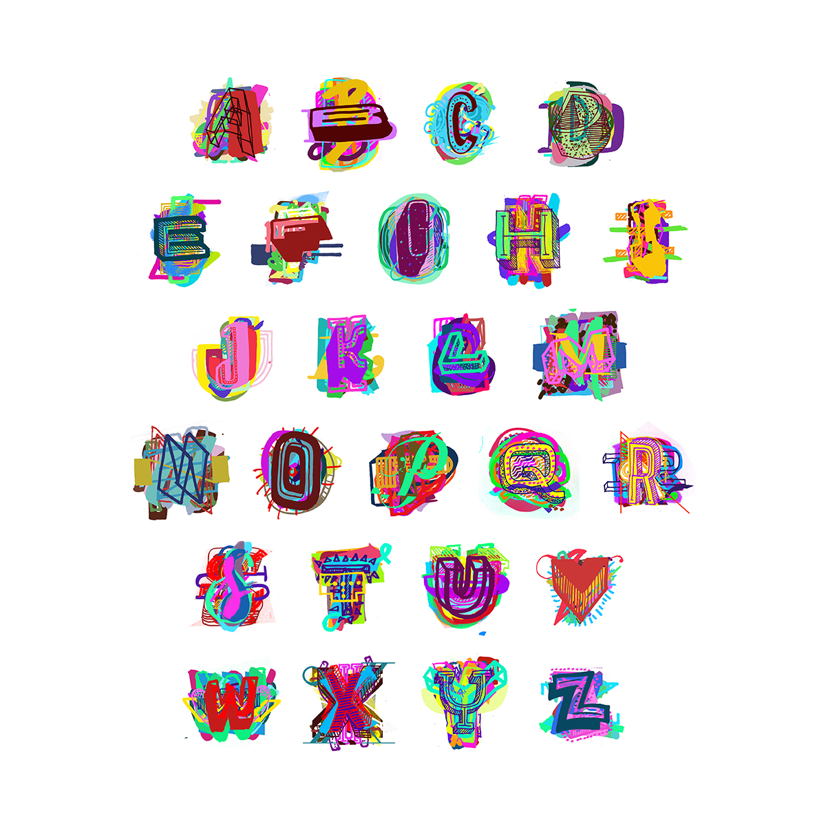
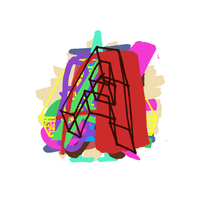
Kromatttic 2016
Speculative typeface design
This was my submission to the ProtoType Speculative Typeface exhibition held alongside TypeCon this year — a hyper chromatic type design called Kromatttic. It unfortunately didn’t make the cut for the exhibition — the ones that did were all really quite excellent, so no complaints. I’d created most of the letters for previous images, but this was great motivation to finish the whole alphabet. There are about 500 individual letterforms within it.
From my submission:
While most chromatic typefaces systematically aim to align letterforms to craft perfectly polished combinations, Kromatttic works with imperfection, disarray, and chance to create far more complex, messy, and diverse letterforms. Due to the nature of the individual components, Kromatttic can shift between being incredibly elaborate (combining a large number of components) to quirky and low-fi (using minimal overlapping components).
Kromatttic was born from a larger project which explores using letterforms to celebrate diversity when communicating positive body image messages. The project aims to disrupt the current cultural status quo, including the resurgence of hand lettered forms which has already been rapidly co-opted, polished, and re-deployed by the fashion and other associated industries.