Exhibition: Project Passion 2017

David SargentDVA, Exhibitions, LetterpressLeave a Comment

Letterpress printing in progress

five a's three ways

close up

Honoured to have been included in the Project Passion exhibition at Minnesota State University. This year, they have the theme of  ‘collaboration’. As luck would have it, I was working on a collaborative project anyway, so the exhibition just added a deadline to it (always very helpful in getting things moving). The exhibition is running from September 18 to October 10, 2017.

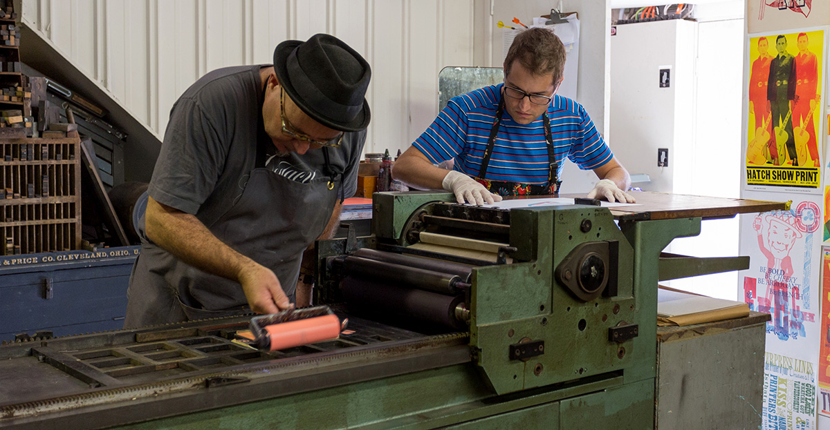
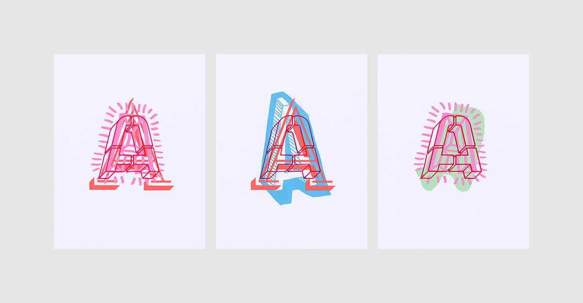
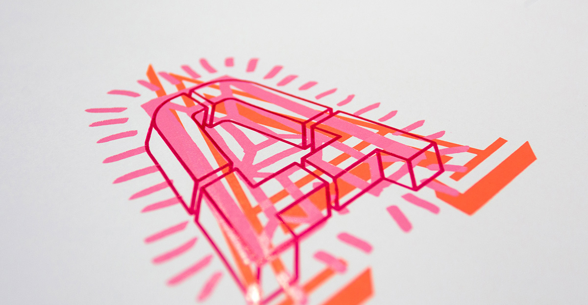
My contribution is a series of letterpress prints created with the generous assistance of Clint Harvey at his Bacon Factory. The letterforms were hand and digitally drawn, then created using laser cut acrylic hand glued to plywood bases. All of the colours were custom mixed from a collection of vintage inks with a white base (to help with opacity). It was my first real letterpress experience, and it took way longer than I had anticipated. Even the creation of the custom blocks seemed to take forever with having to learn how to use the laser cutter, and generating multiple tests and experiments to get it right. But, the final printed images were definitely worth it.

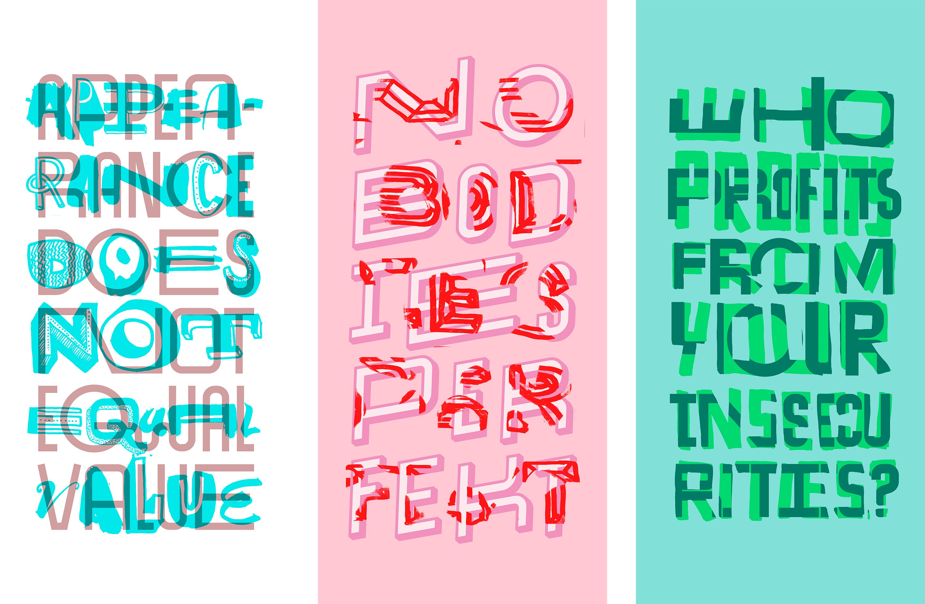
The images are an extension of past work, in that I was interested in the diversity of letterforms. In this project, it was all about bringing together six different A’s and seeing what would happen by overlapping them in various configurations. We did do some tests with all six over each other, and while they looked amazing, the drying time required was just too much for the time we had. Due to my desire to have the forms as opaque as possible, the process requires several passes for each letter, and then a day to rest and dry before the next colour. In all, we created five different print combinations, with three being selected to the exhibition.

Looking at the included artists and designers, the exhibition is bound to be a really high quality collection. The way I can tell: when I go to stalk them on Instagram I’m already following most of them! Can’t wait until all the work is uploaded onto the site to see what else was included.


More Augmented Reality (AR) subvertising experiments

David SargentAugmented Reality, DVALeave a Comment

So I’ve managed to complete a few more of these, learning as I go. One issue that is maddening is the frequency that advertising is changed over. Quite a few times I’ve found a great billboard to cover, taken the shot, generated the artwork, and then found it no longer exists when I return to augment it. I think I just need to be more responsive and get them done the same day.


Experimenting with Augmented Reality (AR) as an activist tool

David SargentActivism, Augmented Reality, Body Image, DVA, LetteringLeave a Comment

No Bodies Perfekt and That’s Ok 2017

I originally looked into Augmented Reality years ago when it was the ‘next big thing’ in marketing circles. It was one of those things that was just too hard and time intensive to work out at the time. Apart from Pokemon Go, it never seemed to take off anyway. Earlier this year someone was showing me an exhibition they had been to featuring Augmented Reality animations. Long story short, I’ve come back to looking at Augmented Reality and have discovered plenty has changed. Many of the browsers of five years ago have closed or been bought out, and the remaining ones are fairly easy to navigate. There has been some pretty good activist campaigns using Augmented Reality too like in Occupy Wall Street and the recent Venezuelan elections.

This experiment was produced using the Layar AR Browser and an animated GIF. It reskins a super large banner in a nearby shopping centre. I did discover some issues with the browser not picking up the banner because of the distance between my iPhone and it, hence the weird angle and portrait format. It seems to work best with something close, with not too many other visuals around. Something to keep in mind for future projects.

Hoping to experiment more with this tool for a bit anyway. A great way to push my work into a more activist space while being non-destructive. It would be great to build my own app with my own browser… and while this is possible… time is a bit of a luxury this year.


New Work in 2017

David SargentDVALeave a Comment

appearance does not equal value mirror

Appearance Does Not Equal Value 2017
No Bodies Perfekt 2017
Who Profits From Your Insecurities? 2017

A few outcomes produced in January. I’m keen to investigate printing onto mirrored acrylic, a technique I first saw last year and was really excited by it. If it works the way I’m hoping, I’ll produce these as full height mirrored prints. All three aim to prompt viewers to really think about what they see in the mirror — a true reflection, or an image to be judged by standards set by others.

Exhibition: Project Passion @ Minnesota State University

David SargentExhibitionsLeave a Comment

david-sargent-4

Studies for Happiness Not Perfection 2015

The physical exhibition happened this time last year, but now an online exhibition has been collated and posted. Some fantastic work included from all around the world. I had two projects selected, the first was my animation Happiness Not Perfection (which was also exhibited in Philadelphia later in the year) and the second was a series of digital prints created during the development of the animation.

Great to be reminded about these artworks — at the time I felt like I was finally starting to get somewhere with my project, and to have them selected for inclusion in this exhibition was a great confidence boost. I haven’t done much animation work since (it’s very time consuming) but perhaps it’s time to continue along that thread.

Don’t Bend Stay Strange

David SargentDVA, MuralsLeave a Comment

_MG_048422

Don’t Bend Stay Strange 2016
Acrylic

First attempt as a largish scale mural. The quote is by David Bowie — the advice he gave the band TV on the Radio. I quite like the quote, it works in the location (Liveworm studio, a student design studio) and with the larger scale project I’m working on too.

Mural painting seems so easy when you see others doing it… but, lessons were learnt! I have so much respect for those who do this often.

Issues round up:

  • When I thought about the larger scale, I thought it would be a good idea to add more detail to some of the letterforms. Lesson: the extra detail can’t be seen from a distance, so not worth the extra effort.
  • I couldn’t get the exact colours I wanted and had to adjust my plans mid-paint when I realised the replacement colours I had picked were too close in tone. The final colours, Glow Magenta and Turquoise by Permaplastik. Lesson: needed to have started the process much earlier.
  • I also realised that working this way just takes way longer than you expect. The initial design was a solid days work (even with most of the letters pre-drawn from past projects). Four hours to sketch out the drawing on the wall (using a projector). Two solid days to paint. It still needs another coat in many places too! Lesson: block out enough time, then double it!

But, even with those issues, really happy that I pulled it off. Have had some positive feedback. I’m thinking all of my studio work will culminate in an exhibition, so great practice as I imagine at least one mural will be involved for that. I’ll be much better prepared!