How to fix ‘darker’ looking PNG files in AR Quicklook

David SargentAR Quicklook, ARKit, Augmented Reality, Reality Composer1 Comment

I have seen a few people ask this question online with no answers offered so thought I might post up my crazy work around.

Something I noticed when AR Quicklook was first released was elements displayed ‘darker’ when compared the original artwork. My assumption on this is that it takes into account ambient light and tries to make any objects seem less vibrant and cartoony. This of course is a problem when you want elements to be vibrant and cartoony!

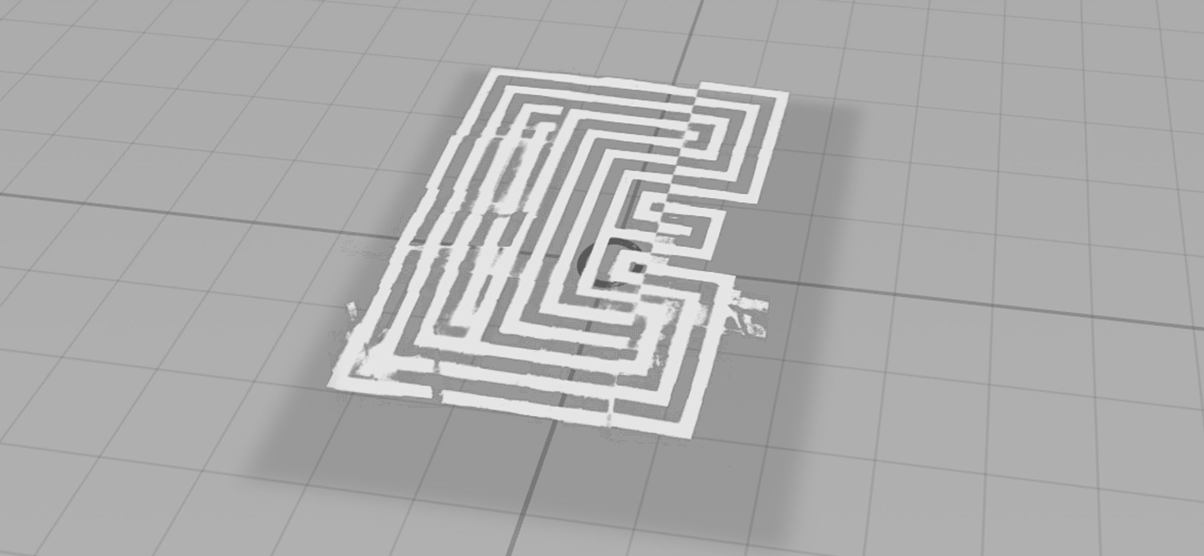
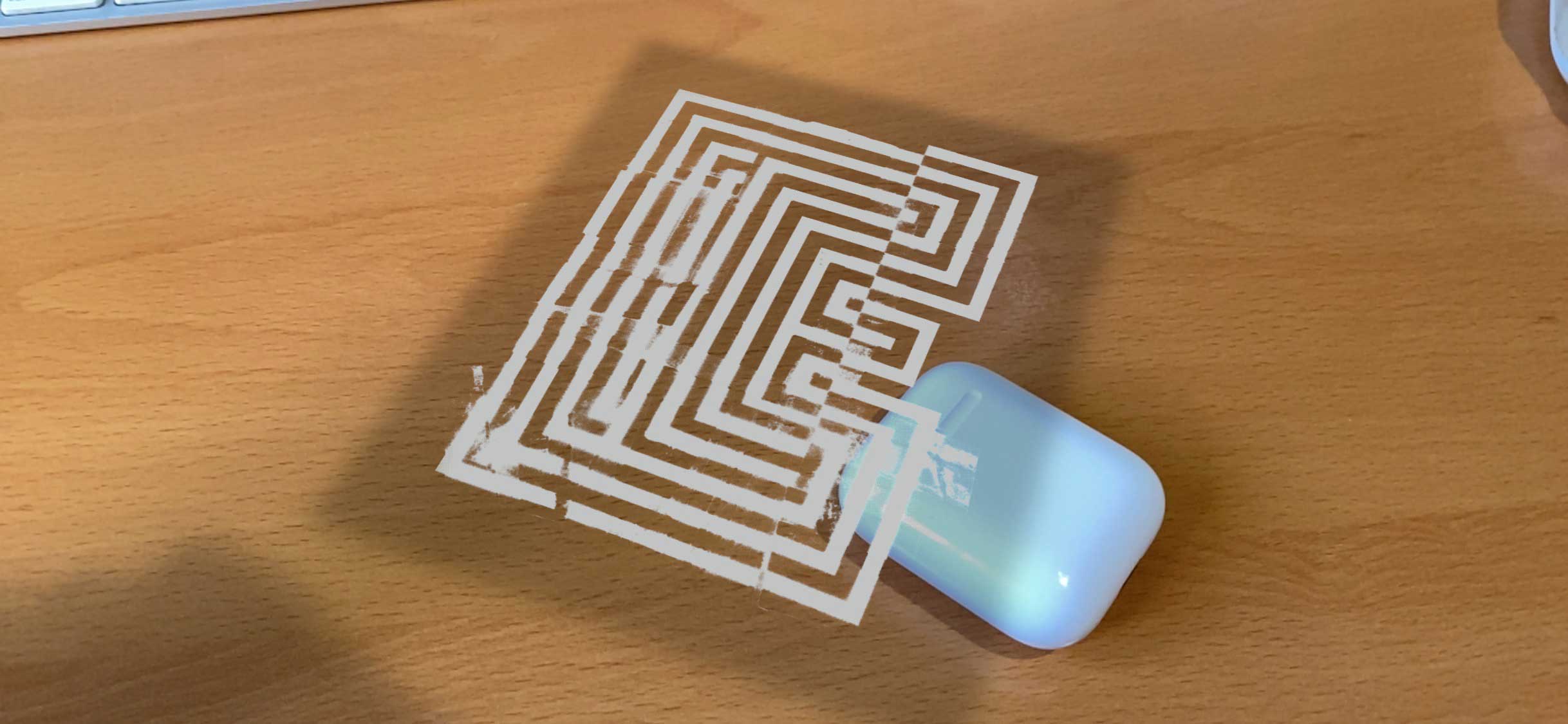
It never really bothered me until I started to experiment with importing vibrantly coloured PNG files into Reality Convertor. No matter what colour space, resolution, compression setting etc, the resulting AR projection looked darker and less vibrant overall. The example images below show a 255/255/255 white PNG which looks noticeably grey in Reality Composer and even more so when viewed in AR Quicklook. You also get a crazy dark shadow based on the overall dimensions of the image, not the alpha mask.

This issue can be replicating with imported 3D elements that have no Emission settings provided. It seems to me that if no settings are found, AR Quicklook defaults to an overall black Emission setting (for both PNG and 3D elements).

So, how to set an appropriate Emission for PNG graphics? There is probably an easier way, but my workaround below:

  • import PNG as an image plane into 3D software (I used Vectary)
  • convert this into a 3D element (so the PNG is used to create as the Base Colour Texture and the Opacity)
  • set Emission at 100% White (looks crazy in Vectary but have faith)
  • export as a USDZ object and import into Reality Converter.

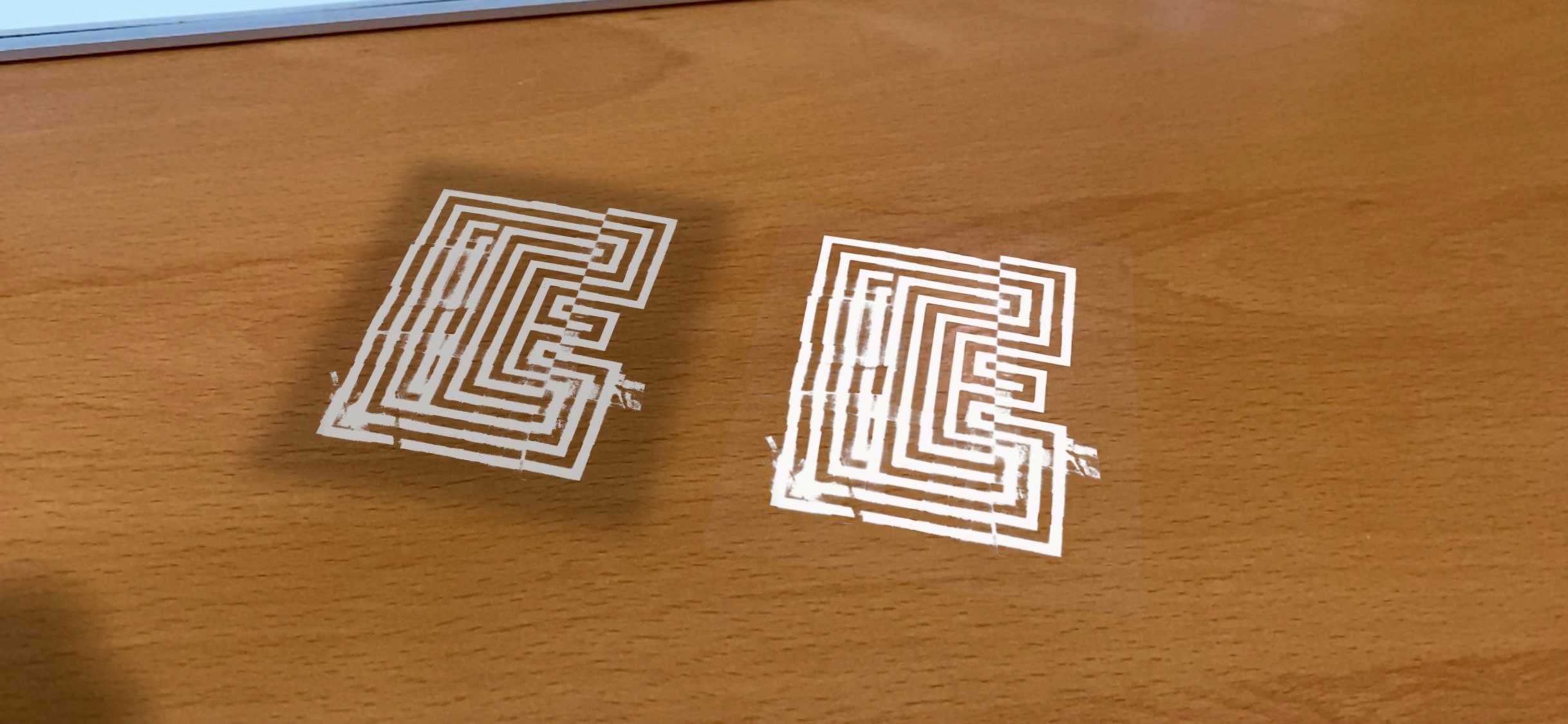
The good news: this renders colours accurately in AR Quicklook and also removes the nasty shadow. The bad news, it also produces a very slight white box across the whole object (image below with PNG on left, USDZ on the right). The white shade stacks, so becomes more noticeable with multiple elements overlapping.

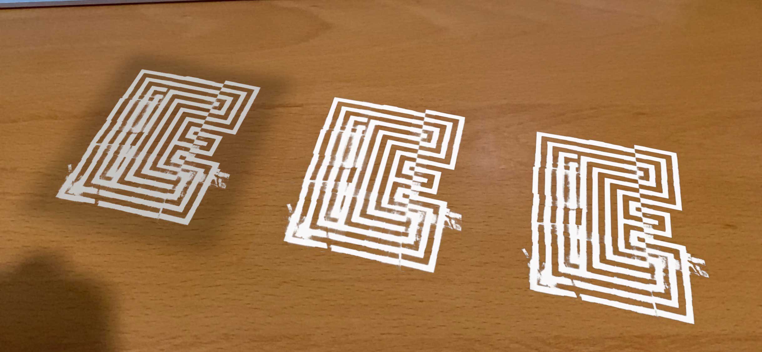
To fix that white box, you need to set the Occlusion to mask out all of the transparent sections. I just used the same texture file as the Opacity setting. This finally provided the outcome I was after (image below with PNG on left, USDZ with 100% white emission in the middle, USDZ with 100% white emission and occlusion mark on the right).

So my workflow is: import PNG to Vectary > convert to 3D > 100% white emission > add occlusion mask > USDZ export > Reality Converter.

This works with colours as well — you can get far more vibrant images displaying in AR Quicklook.

Side effects: I found that when you have multiple overlapping elements treated this way, the very bottom element can sometimes not appear in AR Quicklook. Can be patched by adding a small element at the very bottom.

Anyone out there got a more efficient way? Would love to hear it!

ARKit 3, Reality Composer, and the updated AR Quicklook in iOS13

David SargentAR Quicklook, ARKit, Augmented Reality, Reality ComposerLeave a Comment

Now that classes are starting to wrap up for the year, I finally had a chance to look into the new features in ARKit 3. This version of ARKit has made huge jumps forward in terms of interactivity and immersion. A few features I am excited to experiment with:

  • people occlusion (AR objects can appear in front of and behind people)
  • projecting on horizontal and vertical planes in AR Quicklook
  • ‘bundles’ or individual AR objects in the one file
  • more realistic ray traced shadows in AR Quicklook
  • on-the-fly adjustment of AR objects to better match the backdrop (i.e. Depth of Field, graininess)
  • face tracking using the new Reality file format
  • image tracking using the new Reality file format
  • a massive range of animation and interaction features using the new Reality file format
  • the introduction of a new framework RealityKit, with built in physics and animation systems (i.e. less coding)

If you want to geek out on the specifics, here is the Apple presentation about the new features.

It is amazing to see how much this technology has developed over the short time I have been working in the AR space. Interesting to note that many of the above features are things I have been waiting for from Adobe’s Project Aero. Unfortunately, much of the above is only available on the latest-and-greatest iPhones which has forced me to upgrade #hailcorporate.

Hoping to post experiments soon!

Making animated USDZ files

David SargentAR Quicklook, ARKit, Augmented Reality6 Comments

So I set myself the challenge to build an animated USDZ file. If this is something you are interested in, some thoughts below.

It involved a lot of trial and error. I found the trickiest part was ensuring you followed the same workflow every time, as anything different tended to break the final outcome.

Workflow: Illustrator > SVG > Vectary > DAE > Blender > ABC > Terminal > USDZ

I built the original graphics in Illustrator, exported to SVG and then constructed everything in Vectary. This was then imported into Blender to animate. One frustrating quirk was the formats used. If I imported an Wavefront OBJ file into Blender it all worked well, except when taking the next step all animations were broken. If I used the Collada DAE format the forms were all shifted on import, but the animations worked on export (so I used DAE).

The key is building an Alembic ABC file which embeds any animations. Make sure your animations are nested in an empty node which is in the root of the file (forgetting this detail drove me crazy a few times). I found this format from Blender tended to move elements on export around until I made sure all of the origin points were the same. This article was really helpful. I didn’t have the timings messed up on my experiments, so perhaps this is a Cinema4D issue.

The next step is mapping all of the materials. I read lots of other people’s thoughts on this process, with the most helpful being this article.

Edit: the tedious mapping materials process using the Terminal was made easier with the Reality Converter app from Apple in early 2020.

One thing I have no idea about: the materials in this version seemed to work just fine. I created a different version and the materials didn’t seem to apply the roughness attribute (everything looked far too shiny). I followed the same workflow. This is a problem for another day.

One thing for sure, I will be glad if Adobe’s Project Aero makes animation easy!

No Bodies Perfekt exhibition

David SargentActivism, Augmented Reality, Body Image, DVA, Exhibitions, Lettering

No Bodies Perfekt
Grey Street Gallery
Queensland College of Art
Griffith University
27 November – 8 December 2018

One of the final tasks in my DVA was to reflect on my exhibition of work. It was an interesting experience to install a ‘show’ in a gallery space and I learnt a lot. My big idea was to have printed work in one section and augmented work in the other. I would definitely do it differently if I went back in time, but, at the end of the day, you could say that about most things. Have included my reflection below.

I had not planned for any formal investigation during the two-week exhibition period; however, I was present within the gallery space for the majority of this time. Being present provided an opportunity for the casual observation of audience interactions and engagement, as well as discussions with visitors to gauge their interpretations and feedback. Visitors to the exhibition included undergraduate students, postgraduate students, other university faculty members, design industry professionals, and members of the general public.

I identified very early there was a diversity of reactions and knowledge with augmented reality technology. Younger visitors natively understood how to interact with the iPad without needing to read the provided instructions. They successfully projected graphics into the gallery space and enjoyed being able to walk around and interact with the projections. In discussions, I discovered that these visitors had previous exposure to other augmented reality experiences, typically through apps such as Facebook, SnapChat, and Pokemon Go.

Many of the younger visitors made comments on negative experiences with advertising in the public sphere and could see the benefit in being able to ‘block out’ images with alternative messages like those included in No Bodies Perfekt. Being able to participate actively was discussed as being empowering. It was encouraging that several visitors initiated discussion on wearable technology and how this kind of initiative may become even more relevant in the future. 

In comparison, other visitors struggled with understanding how augmented reality projections worked. I found that even with the provided written didactics and my verbal instructions some were unsure of how to operate the iPad. During discussions with these visitors, I discovered they had little or no experience with augmented reality. Once they understood the technology and had successfully interacted with projected graphics in the space, I received positive responses.  

Another insight gained was that the layout of the exhibition and the didactics provided did not explain my process or the project adequately. I had incorrectly assumed that the studio progression would be evident to visitors; however, I discovered that most visitors were confused with the poster display when they first entered the space. Likewise, the relevance of the statements used in the graphic outcomes was lost on some. Luckily, due to my presence in the gallery, I was able to provide visitors with more background context and provide detail on my overall intent, talk them through the phases of studio experimentation, and explain how this culminated in augmented reality dissemination.

The gallery exhibition format had the potential to work well; however, I found it was only successful when combined with this additional context and demonstration. If the work were to be shown again in this format, I would seek to improve the didactics and offer more background on the overall project and a more precise outline of the evolution of my studio outcomes. I would also provide a clearer explanation of why the final application took the form of augmented reality projections. Several visitors suggested a video demonstration of augmented graphics in situ would have been an advantage, especially those who had seen similar videos of my work online previously.

As explored earlier, body image issues are not limited to one demographic; however, adolescence is a critical period of vulnerability. Encouragingly, I observed active engagement by younger visitors who responded positively to the augmented reality experience. The technology was something they felt very comfortable with; they understood how it worked, and could immediately see how it could be applied. Even more encouraging were the discussions the experience sparked. Many referred to their own body image perceptions and negative experiences with advertising and noted that the exhibition had allowed them to gain a different perspective on this issue. While the purpose of this research project was to explore alternative strategies in a speculative creative studio context, these informal interactions indicate this direction warrants further development, and further research to include specific user testing.

Exhibition!

David SargentActivism, Augmented Reality, Body Image, DVA, Exhibitions, Lettering

This snuck up so quickly, but I’m (hopefully) nearing the end of my Doctor of Visual Arts candidature. Excited to pull it all together and fill a room with graphic prints and augmented reality objects. All of the printed banners look great, my only concern is the technology failing me. It’s all tested okay, but you just don’t know when things like this go ‘live’.

Typism Canberra

David SargentAugmented Reality, Body Image, Conferences, DVA, Lettering

Super excited about the upcoming Typism conference happening in November, especially because I’ll be one of the speakers this year along with Ryan Bowles, Kiel Tillman, Zane Ruyssenaers, Libbi Reed, Aurelie Maron, Wayne Thompson and Matt Vergotis! Usually Typism occurs on the Gold Coast, but this is a ‘special edition’ conference as part of the DESIGN Canberra Festival.

I’ll be talking about my DVA project, issues around body image and eating disorders, my approach to lettering, and how I have started to use augmented reality as a disruptive tool. Hopefully it all makes for an interesting talk.