New toys: iPad Pro and Procreate app

David SargentDVALeave a Comment

challenge-perfektion-embed

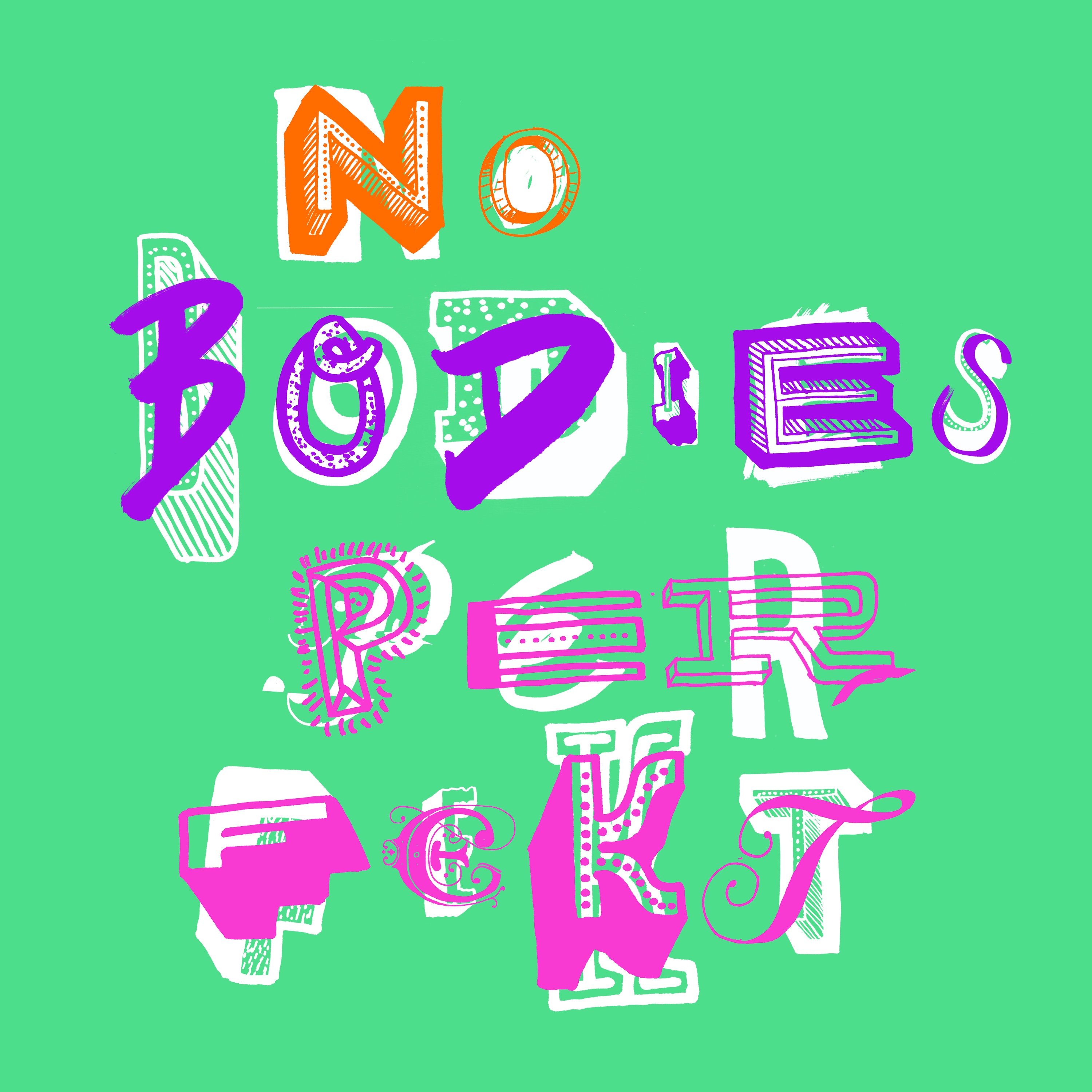
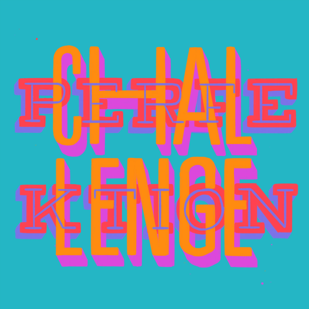
Challenge Perfektion 2016
Digital illustration

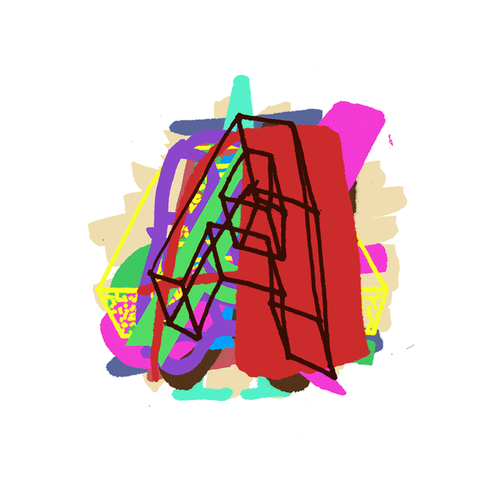
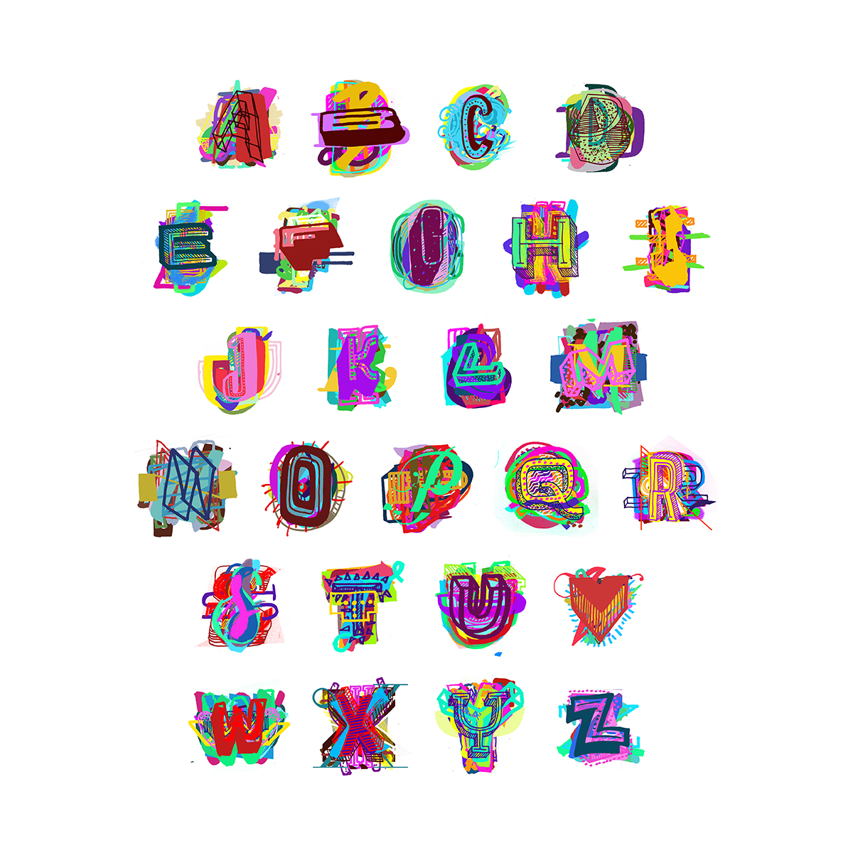
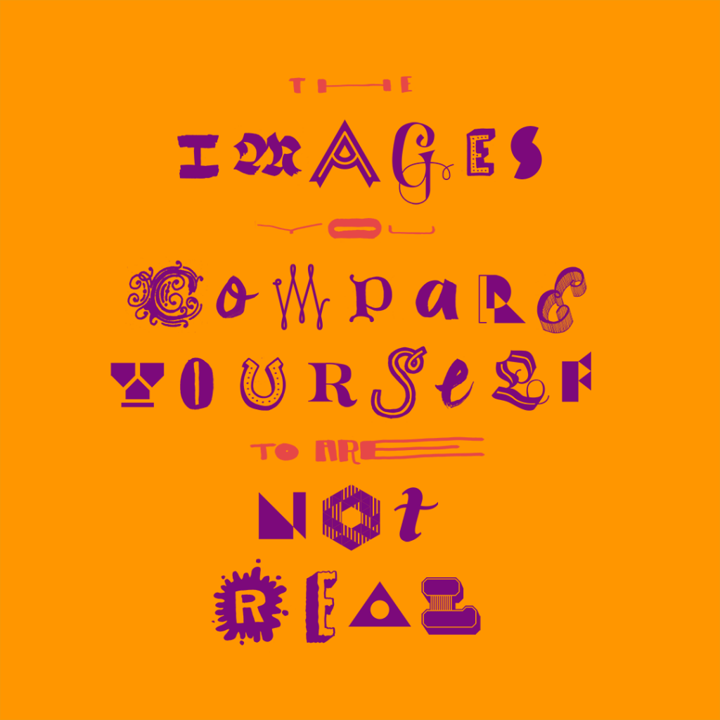
I’ve been looking at getting an iPad Pro ever since they came out, and glad I finally did. I’m hoping it will save me some time creating images — my current workflow is to draw everything manually, scan it in and then assemble / colour in Photoshop. When you’re dealing with multiple lettering styles for each letterform generated, it can take a long time. My first experiments have been great fun. The above was created using the Procreate app and took around four hours. Probably could have produced this in the ‘traditional’ way a bit faster, but I am still getting used to using the stylus rather than a pencil / pen / brush. Colouring and layer use isn’t as good as Photoshop, so this has been the biggest challenge so far. The very best thing: drawing straight lines so easily. I’m always smudging everything when using a ruler, so it’s been heaps of fun.

But, a warning for myself: don’t forget imperfection is important in what I do. I caught myself clicking the ‘undo’ button a few times which I think could be a bad habit to get into. As amazing as they are, the straight line tool and the ability to smooth out curved lines are also dangerous. I’ll have to be selective.

Kromatttic speculative typeface design

David SargentDVA, ExhibitionsLeave a Comment


kromatttic_typeface_animated

Kromatttic 2016
Speculative typeface design

This was my submission to the ProtoType Speculative Typeface exhibition held alongside TypeCon this year — a hyper chromatic type design called Kromatttic. It unfortunately didn’t make the cut for the exhibition — the ones that did were all really quite excellent, so no complaints. I’d created most of the letters for previous images, but this was great motivation to finish the whole alphabet. There are about 500 individual letterforms within it.

From my submission:

While most chromatic typefaces systematically aim to align letterforms to craft perfectly polished combinations, Kromatttic works with imperfection, disarray, and chance to create far more complex, messy, and diverse letterforms. Due to the nature of the individual components, Kromatttic can shift between being incredibly elaborate (combining a large number of components) to quirky and low-fi (using minimal overlapping components). 

Kromatttic was born from a larger project which explores using letterforms to celebrate diversity when communicating positive body image messages. The project aims to disrupt the current cultural status quo, including the resurgence of hand lettered forms which has already been rapidly co-opted, polished, and re-deployed by the fashion and other associated industries.

kromatttic_square

Who benefits from you feeling bad about yourself?

David SargentDVALeave a Comment

who-benefits-animated

Who Benefits From You Feeling Bad About Yourself? 2016
Digital illustration

I spent a lot of time crafting the wording for this image — multiple drafts over a few months actually until I was happy. The original was much longer, but when I started to create the image was just far too complicated. I’ve intended it to be read two different ways — a general statement on the wasted time thinking negative thoughts and also a wider critique on our media and society. The construction was happily quite short compared to other images, as I’ve recycled most of the letterforms from past work. I’m yet to decide if this is a good thing to do, as it somewhat reduces the idea of diversity if you see another image using the same letterform…

No Bodies Perfekt

David SargentDVALeave a Comment

NOGD5536

No Bodies Perfekt 2016
Digital illustration

Continuing along the same path I have been this year, looking at combining and overlapping type to communicate diversity. Happy with the text I came up with for this outcome which explores the idea of including grammatical and spelling errors. Combining this technique with forcing myself to overlay ‘successful’ letterforms with less ‘perfect’ letterforms really pushes me out of my comfort zone.


From slogans to aphorisms

David SargentDVALeave a Comment

images-are-not-real-for-web-1080px

The Images you Compare Yourself to are Not Real 2016
digital illustration

In an effort to consider the written content as well as the visual, I spent a bit of time looking further into prevention campaigns that combat body image related issues. The result was the above aphorism (my definition: kind of like a slogan, but with a bit more substance behind it).

An interesting point I had previously read but forgotten about was that building positive body image has been proven to be a successful tactic in the prevention of negative body image. Interventions that also seek to generate critical discourse on cultural influences are the most successful. The above aphorism was developed from a 2005 study by La Trobe University in Melbourne which focussed on testing key messages and their effectiveness with adolescents. It’s a combination of two messages ‘images of people in the media are not real’ and ‘don’t fall into the comparison trap’ that they found resonated highly with their audience.

I think it’s a critical message, especially as ten years on technology now allows anyone with a smart phone the ability to digitally modify photographs that they publish and distribute. As Fred Ritchin notes, reality is increasingly being seen as the ‘first draft’ that needs to be improved and enhanced. It’s important to remind ourselves that those enhanced images are not a true reflection of the world.

I’ve also continued my exploration on a mixture of lettering styles to promote the idea of diversity and imperfection. While probably not as successful as the animated experiments in this area, I hope it still gets the message across. The elongated and compressed letters blatantly ripped from the excellent new identity for Parsons by Paula Scher and a Issey Miyake logotype I spotted in Tokyo a few months ago. This idea of dramatic distortion is something I would like to explore further.

Reflections: next steps

David SargentDVALeave a Comment

Happiness-not-Perfection-remix-smaller

The space between semesters is always an ideal time for me to get things done. Other job responsibilities are still present, but I also have the luxury of less pressure and time to breathe and think. I’ve been reasonably productive in the last few weeks, starting where I left off last year—experimenting with letterforms. Even though I swore never again, I’ve produced some more animated experiments too. Surprisingly, I also got around to posting some of this work to Instagram, something I’ve been trying to do for a few years now. One of the results is above, approaching an image I made last year, but reducing the visual complexity. I kinda think it works, but also think I’m starting to spin my wheels at the same time.

So, this small chunk of work represents a turning point, as I’ve been able to reflect on my work and believe it needs to evolve. To date, I’ve stuck with either individual letterforms or short statements to use, but a supervisor brought up the topic of content last year, and ever since it has bugged me. The ‘slogan’ has been perfect for this stage of the overall project, but now is the time to start raising the stakes. From now on I’ll be thinking harder about the words I use, rather than just how they look…