A common question that people ask when I am explaining my research project (at least, trying my best to) is ‘what’s the problem with using photography?’. After a bunch of reading and thinking about it the reason is as clear as day for me, but, I can see why people would ask. So, this post aims to explain it the best way I can.
We often become outraged by images of ‘anorexic’, ‘buff’, and ‘stacked’ fashion models and public figures we are exposed to every day. These kinds of images (combined with a whole bunch of other cultural forces) promote unobtainable body shapes as something we should all aspire too. These body shapes are commonly called the ‘thin’ and ‘masculine’ ideals. If someone internalises these ideals, they accept them as being normal, and their own body as abnormal. This can lead to all sorts of issues, from negative body image to eating disorders, and depression. If you want to know more, read Body Image by Sarah Grogan of Manchester Metropolitan University who writes about this topic in a very clear and concise manner.
How visual designers use photographs
So, how should visual designers approach communication related to body image and eating disorders (and more generally, communication related to youth and other high-risk audiences)? Currently, in the face of this, the use of ‘average’ and ‘healthy’ body images would be considered a safe strategy to avoid harm (I certainly did before starting this project). It’s even suggested by Australia’s National Advisory Group as a key strategy of promoting body image diversity. They state using ‘a more diverse range of people within the fashion, advertising and media industries’ allows ‘more people to identify with popular images of beauty and help them view their own bodies more positively’ within their Code of Conduct on Body Image.
However, from my perspective, any photographic representations of a body — even one which might be deemed ‘average’ or ‘healthy’ — should be avoided if possible.
A few images used on the NEDC website
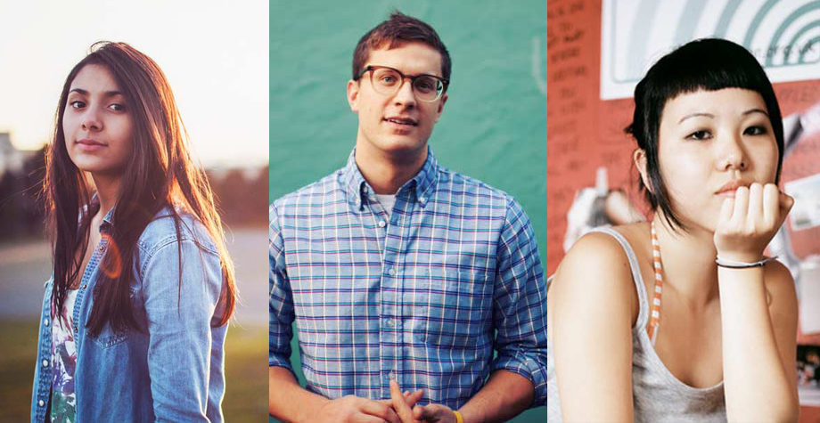
A great example of is kind of strategy at work can be found in the website and other designed material produced by the National Eating Disorders Collaboration (NEDC). The designers involved have put thought into the visuals used, as the people depicted in the photographs are happy, smiling, friendly, and above all else, have the currently accepted ‘average’ body size. I can imagine the dilemma in the studio when these decisions were made — photographs rejected left and right trying to narrow it down to only those that looked ‘average’. In the end, the selected photos would make sense to the designers involved — in their mind, it would have been a job well done.
How we all read a photograph
An important point to make is that we might look at the same photograph, but we read it differently. Photographs have also been historically elevated in regards to their ‘truthfulness’ — for example ‘the camera never lies’. Scholars such as Susan Sontag, John Berger, and Roland Barthes have written a great deal about this topic, and while the way they describe it is different, my interpretation is that they all come to the same conclusion: while we might perceive a photographic image to have a static and true meaning it does not. What we read is our own individual narrative created by our own background, views and experiences — our ‘lexicon’ as Barthes described it.
As an aside, in the sea of essays and books I’ve been exposed to in recent times, Sontag’s On Photography, Berger’s Ways of Seeing, the updated Understanding a Photograph, and, Barthes’s Camera Obscura were such a relief to read. They all have a way with words that made their work a joy (imagine that) rather than a chore to read.
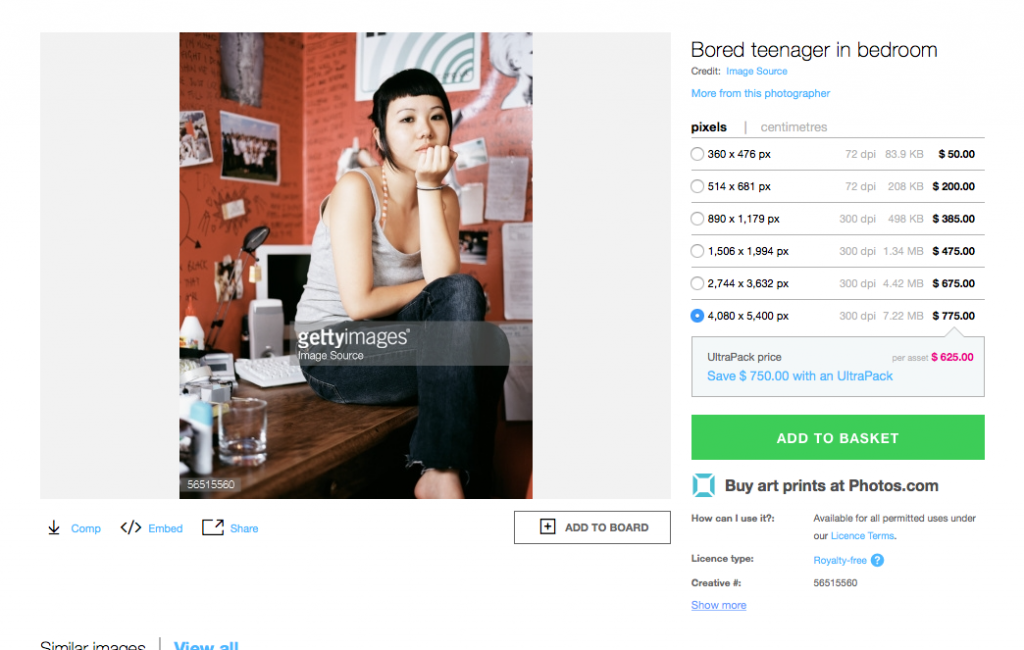
All images have been sourced from online photo libraries — this particular one is titled ‘bored teenager in bedroom’
The limited range of visual diversity in the NEDC examples — not only in body shape but in age and race — is not surprising when you consider they have all been sourced from generic online stock photography libraries. Stock libraries are notorious for perpetuating homogenised ideals, best explained by Ellen Lupton & Abbott Miller in their book Design Writing Research, when they wrote that stock libraries provide a ‘tremendous increase in the supply of pictures available’ while simultaneously ‘narrowing the representational field’.
The problem with photography is, these carefully selected images may only serve to reinforce negative thoughts because of how the viewer reads the images. Viewers who are susceptible to developing — or have already developed — a distorted or ‘negative’ body image could compare themselves with these representations of ‘average’. Objectively, there is nothing average about these images anyway, as while it appears they have avoided anyone with a catwalk model frame, all the people included are ridiculously good looking. Similar criticism has been aimed at the popular ‘Campaign for Real Beauty’ by Dove (actually owned by the giant Unilever). Some have suggested that even though it brought the topic of diverse body types into mainstream conversation, it only really promoted a restricted view of what ‘beauty’ was, with the only real positive being a massive increase in sales of Dove products.
The real shame is that the information provided on the website is fantastic: well researched, well written in an understandable and relatable way — but the visual design works totally against it! It’s not really the fault of NEDC or the designers either — most design schools inadvertently perpetuate the thin and masculine ideals with no alternatives offered (coming from an educator in this field).
If you’re interested in the topic of the power of images, Helen Razor has recently written a face-melting take down of the Butterfly Foundation and their use of celebrity photographs in their recent Don’t Dis My Appearance campaign.
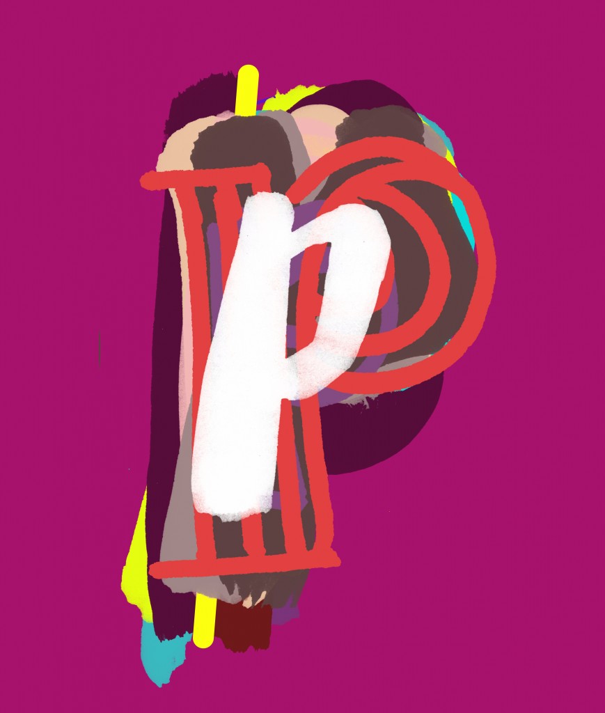
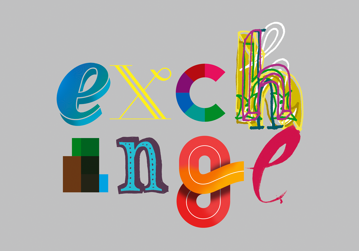
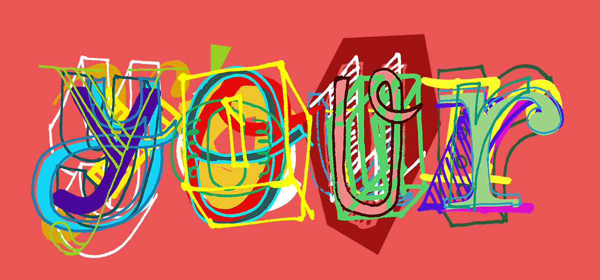
But how is using lettering any different?
The visual nature of communication in this area is important — the information is critical and the visuals can assist in backing up the information and also making it easier to digest. I’m not naive enough to believe that using lettering rather than photographs is going to completely solve this problem, however I do believe that the use of lettering can communicate a greater range of visual diversity (that’s kind of the whole point of my doctorate study). It’s still a grey area though, and recent use of lettering in fashion advertising is making it blurrier — it will be important to make sure the lettering I produce is distinctly different from the mainstream, yet diverse, and visually interesting.